Your Bakery
Case Study
Transforming the bakery ordering experience through thoughtful
UX/UI design and user-centered research.
March 2025 - June 2025
Lead UX/UI Designer


Project Overview
Project Name: Your Bakery - Bakery Ordering App
Objective: To create a mobile app that allows users to pre-order artisan bakery items for pick-up or delivery, while showcasing daily specials and seasonal treats in a visually appetizing way.
Target Audience: Busy professionals, parents, and food enthusiasts aged 20-45 who appreciate fresh baked goods but don’t have time to visit the bakery in person during peak hours.
Timeline: March 2025 - June 2025
Your Role: Lead UX/UI Designer
Problem Statement
Understanding the core challenges faced by both customers and the bakery business.
Customers often miss out on popular items they sell out quickly. The bakery’s ordering process was limited to in person visits and phone calls, which frustrated users and caused missed sales opportunities.
The Core Problem
Impact on Business & Users: Users experienced long waits, uncertainty about product availability, and inconvenience in planning orders ahead. The bakery lost potential revenue from customers unwilling to queue during peak hours.
Stock Uncertainty
Customers often miss out on popular items they sell out quickly, leading to disappointment and lost sales.
Limited Ordering Options
The bakery’s ordering process was limited to in person visits and phone calls, creating friction for busy customers.
Long Wait Times
Customers experienced long queues during peak hours, making it inconvenient to purchase fresh bakery items
Project Goals
Enable customers to browse, reserve and pay for bakery items in advance
Reduce wait times and prevent stock disappointment
Showcase daily specials with appealing visuals to drive sales
Create a seamless mobile-first ordering experience
Research & Discovery
User Interviews
In depth conversation with 15 existing customers to understand pain points
Surveys
Quantitative data from 50+ potential users about ordering preferences
Research Participants
10
Total Participants
18-46
Age range
Competitor Analysis
Analyzed 8 food ordering apps to identify best practices and gaps
Usability Testing
Observed user behavior with existing ordering systems
User Personas
S
Sarah
28, Marketing Executive
Wants to order in the morning and pick up during lunch break.
Pain Points
Limited TimeUncertain availabilityGoals
Quick OrderingMobile ConvenienceLong queuesGuaranteed pickupA
Alen
38, parent of two
Prefers weekend deliveries for family breakfasts.
Pain Points
Bulk ordersWeekend availabilityEasy reorderingFamily PreferencesFamily sized portionsDelivery OptionsKey Journey Map Insights
Pain Points Discovered
Limited communication about item availabilityUnclear menu descriptions and pricingLack of mobile-friendly ordering systemsNo way to plan orders in advance
Opportunities Identified
Push notifications for daily specialsReal-time stock status indicatorsEasy repeat order functionalitySeamless pickup scheduling
Design Process
1
Basic layout structures focusing on user flow and information architecture
Navigation patterns mapped
2
Detailed designs with visual styling, interactions
3
From initial wireframes to polished high-fidelity designs, following an iterative design process.
Low-fidelity Wireframes
Key user flows identified
High-fidelity Prototypes
Visual design system created
Interactive Prototypes Built
User Testing & Iteration
Testing with real users and iterating based on feedback
Usability issues identified
Content hierarchy established
Responsive Layout Established
Design Improvements Implemented
Final Designs validated
Visual Design


Testing Validation
A comprehensive testing approach was used to validate design decisions and improve usability.
Usability Testing
Task-based testing on core flows: browsing specials, customizing orders, and checkout.
A/B Testing
Compared different layouts for the menu screen and checkout flow variations.
Interactive Testing
Multiple testing rounds with design refinements between sessions.
Chickle
Design Evolution
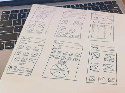
Paper Wireframes
Taking the time to draft iterations of each screen of the app on paper assured that the elements that made it to digital wireframes would be well-suited to address user pain points. I prioritized a quick and easy ordering process to help users save time.

Low-fidelity wireframes
After sketching out some wireframes and thinking through the preliminary flow, reviewed what was necessary, unnecessary and what areas needed improvement.

High-fidelity design
The final hi-fi prototype after usability testing shows user flows for customizing a cake, choosing delivery option and checkout.

💡 Design Decisions & Iterations
Initial User Feedback
Early usability tests showed that users wanted:
Faster ordering with fewer steps
Clearer customization options (size, cream, toppings)
Delivery flexibility and order tracking
Design Improvements
We refined the layouts to feature larger product images, added quick customization fields, and introduced a delivery option with live tracking. These updates created a more delightful and efficient ordering experience.
Moodboard Inspo
#0A0909
#FAE2D1
#F28F5B
#FAE2D1
#FAE2D1
Fonts
SF Pro Display
💡 Key Findings from Usability Testing
We identified three major needs based on user research and usability testing:
Ordering & Navigation
❌ Issues Identified
Specials section was hidden when browsing the full menu
Filter options (vegan, gluten-free) were hard to find
Back button placement felt inconsistent
✅ Solutions Implemented
Pinned daily specials to the top of the home screen
Added quick dietary filters with icons
Standardized navigation across all screens
Customization
❌ Issues Identified
Users wanted to choose product sizes, pieces, and ingredients
Lack of dietary information (fat content, gluten-free options)
✅ Solutions Implemented
Added detailed ingredient and nutrition information
Introduced customization fields for size, cream, and toppings
Checkout & Delivery Experience
❌ Issues Identified
Busy users found pickup inconvenient.
No way to track delivery status.
Pickup time slots were unclear and confusing
Checkout felt too long with unnecessary steps
✅ Solutions Implemented
Added a clear time slot selector with availability indicators
Introduced home delivery option with integrated live tracking
Streamlined checkout to 2 steps, including guest checkout option


✅ Impact: These improvements reduced ordering friction, made the app more inclusive with dietary info, and provided flexible order fulfillment (pickup or delivery).